Root Riot Identity
Root Riot is a Canadian plant retailer for students and apartment dwellers seeking affordable greenery. The brand needed to position itself as an edgy, down-to-earth alternative to high-end plant boutiques.
Deliverables
Logo, web visual identity, brand applications
Client
St. Lawrence College
Research & Ideation
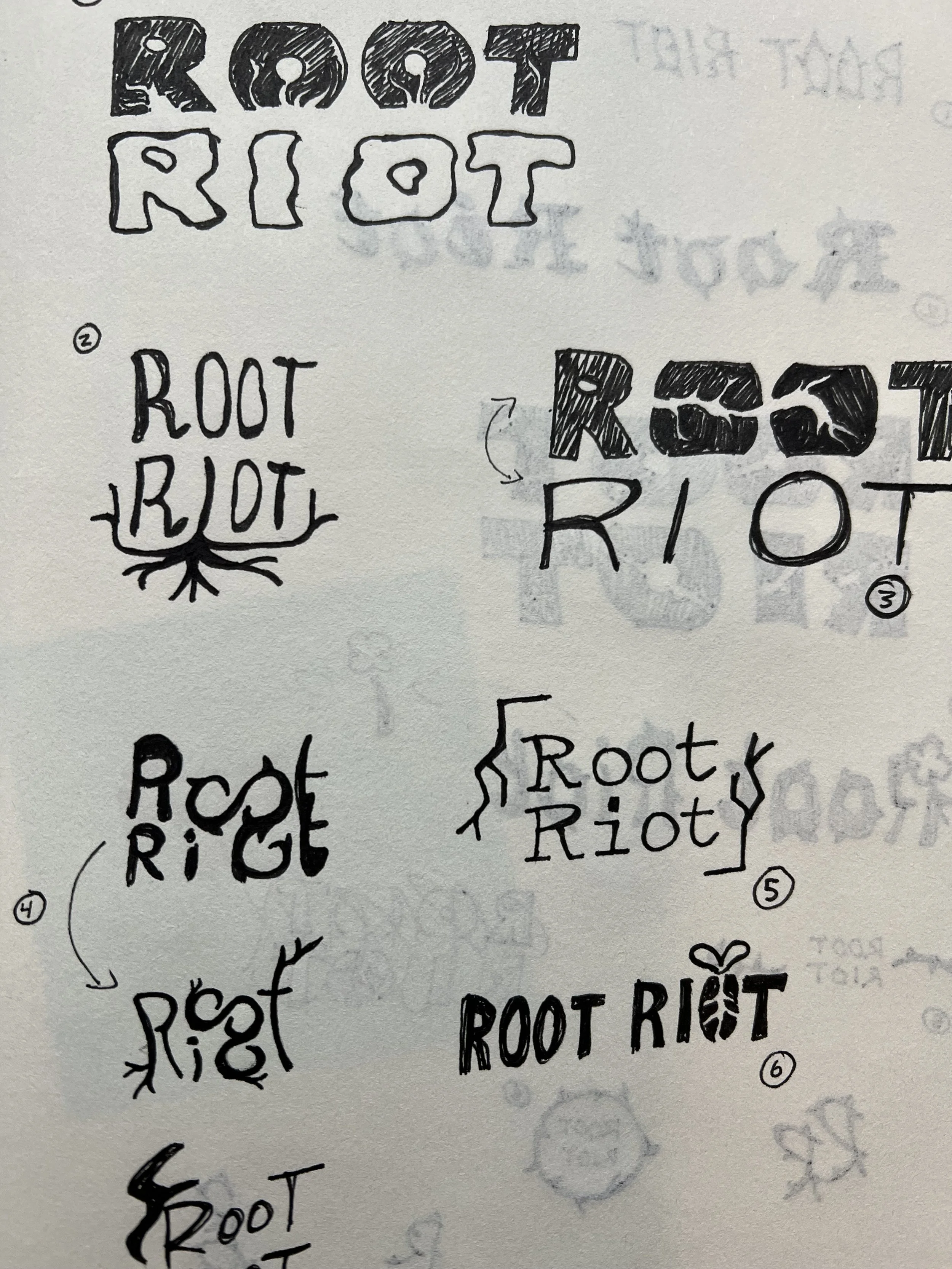
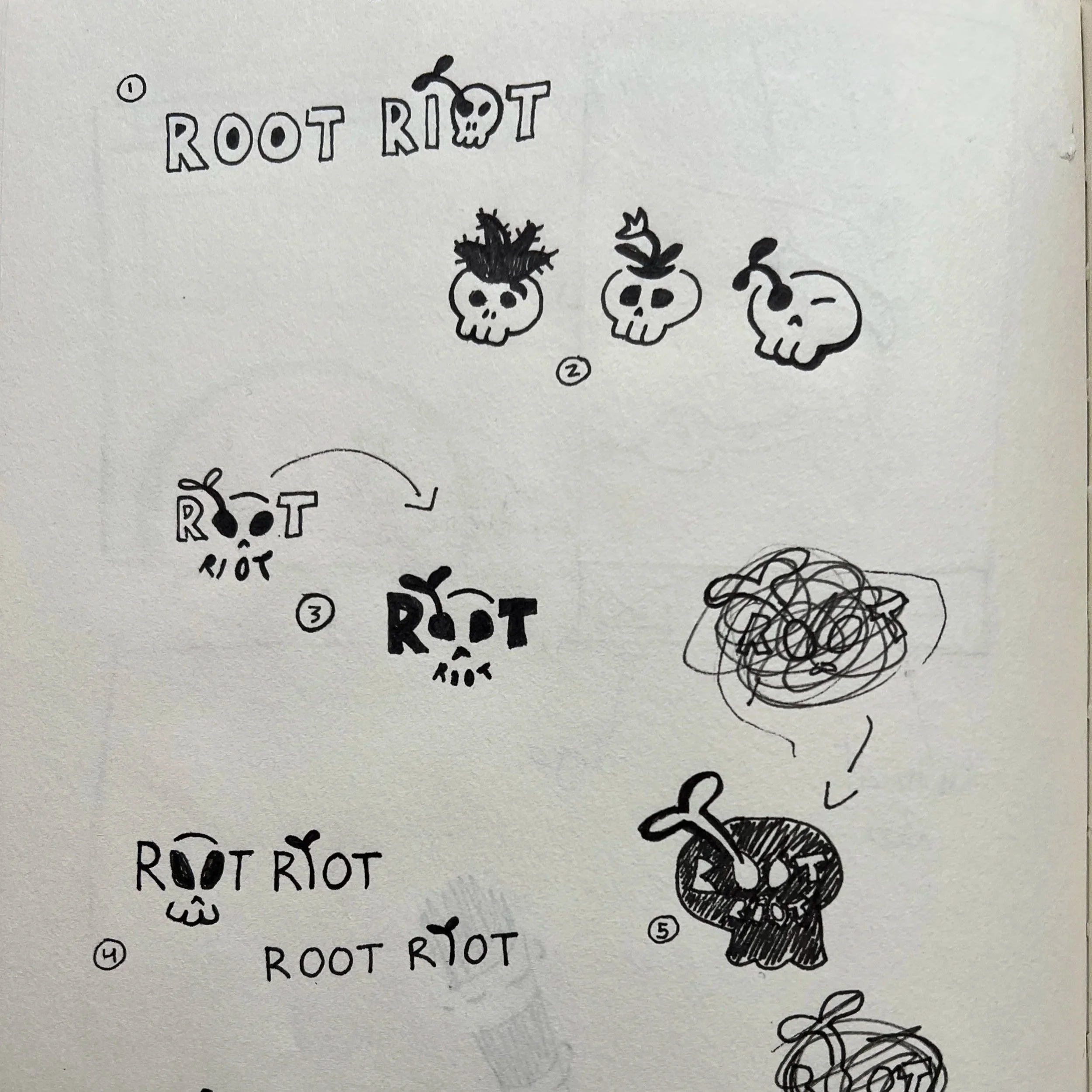
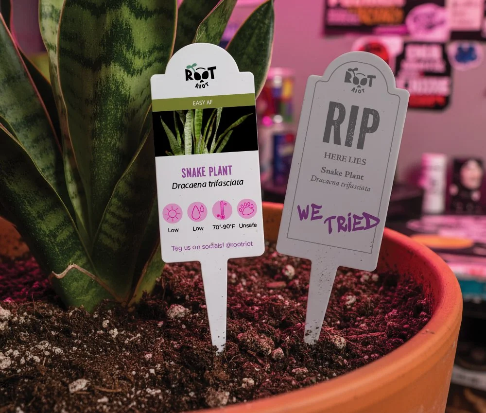
Root Riot’s competitors follow the same pattern: minimalism, tidiness, and pristine plants. Root Riot works in real conditions—plant care that’s messy, chaotic, and rewarding. The logo and digital identity had to show that. Ideation started with mind-mapping visuals to move past cliché motifs and into something distinctly Root Riot. Skull imagery was introduced to express learning through mistakes and the loss that comes with growing houseplants.

Concept
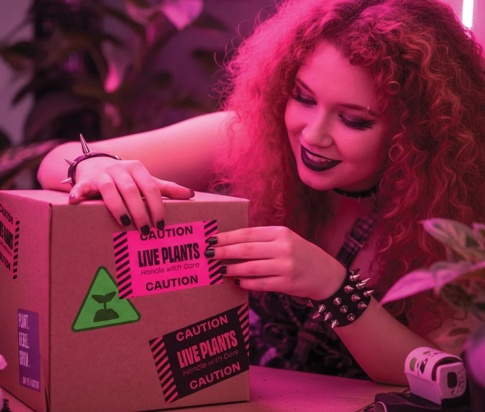
The brand attitude is casual and rebellious, echoing the youthful independence of its audience. Root Riot’s voice is friendly, witty, and informed—communicating expertise without pretension. The new identity celebrates imperfection and experimentation, encouraging first-time growers to jump in without fear of failure—from industrial warning stickers to plant tags that double as tombstones.
Visuals
The skull-and-plant emblem, built from the letterforms of Root Riot, merges life and decay to represent growth through messiness. Hand-lettering influenced by linocut and an energetic palette supports Root Riot’s positioning as “not like other shops”.
Outcome
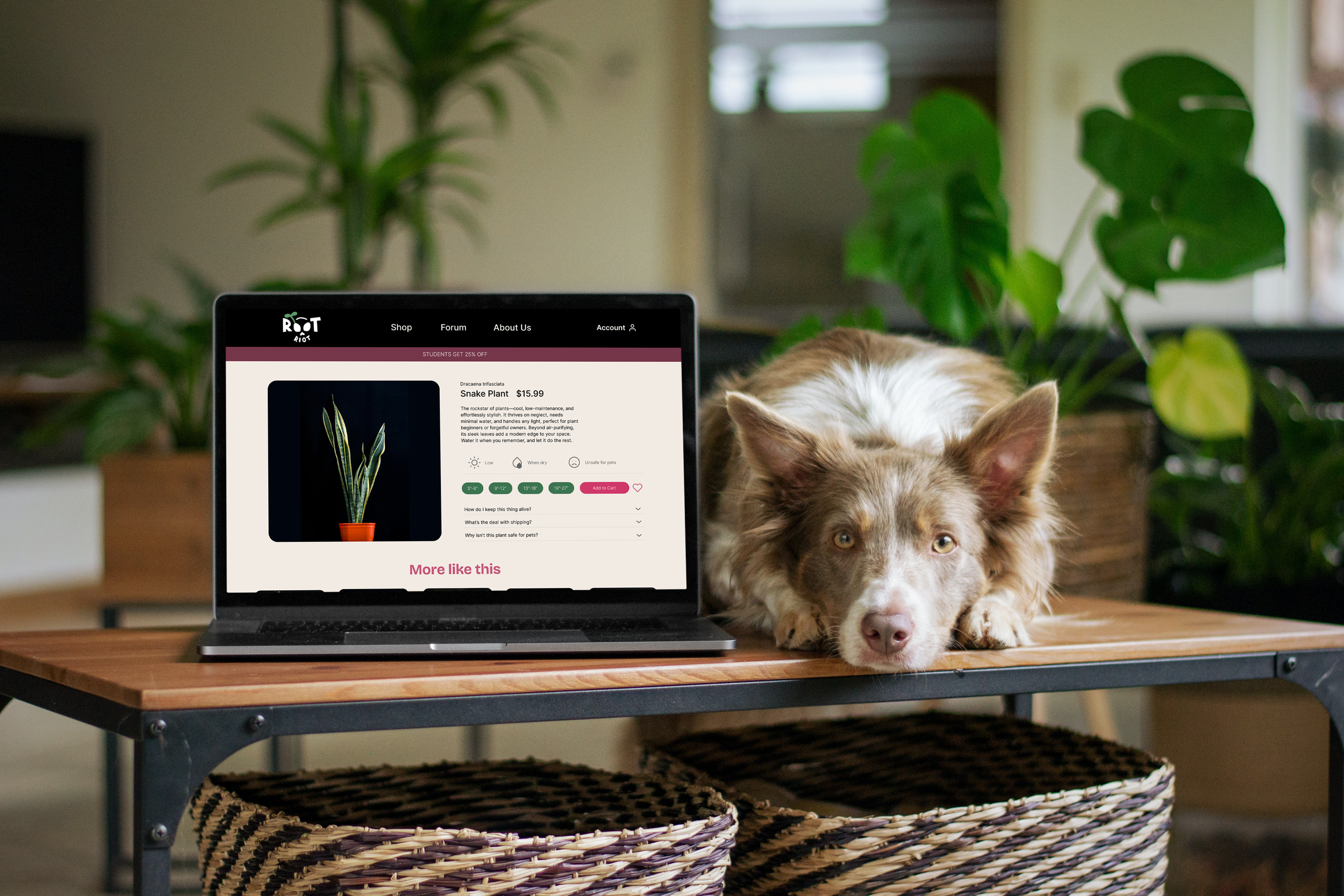
From the browsing experience online to opening up the package, Root Riot distinguishes itself from polished competitors by embracing authenticity. The branding invites students and renters to cultivate their own “indoor jungle” with confidence and personality.