Association Rebrand
The Canadian Botanical Association (CBA) represents botanists nationally and abroad, connects the botanical community and supports research and collaboration. The rebrand needed to clearly communicate their values of growth, discovery, and community.
Deliverables
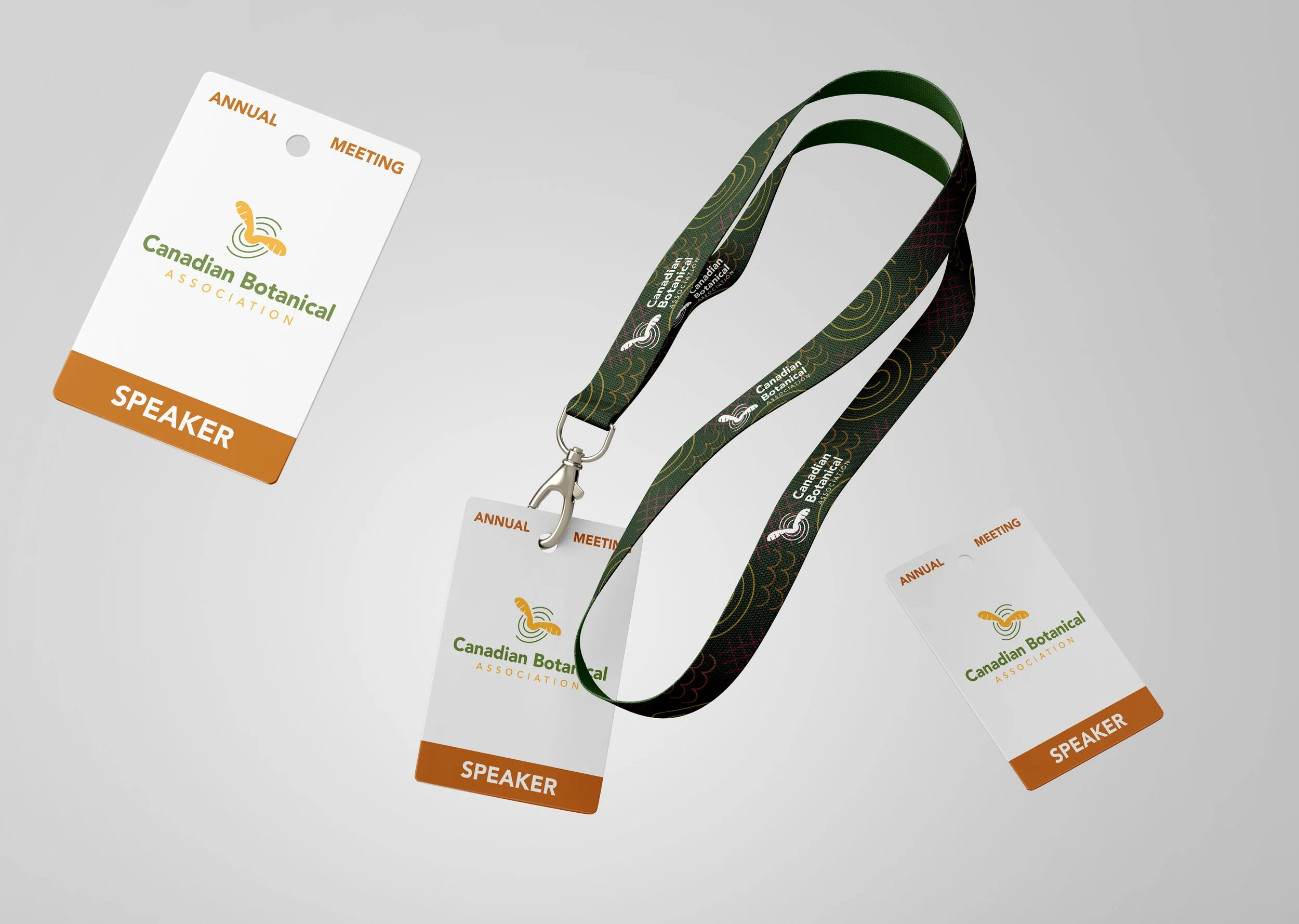
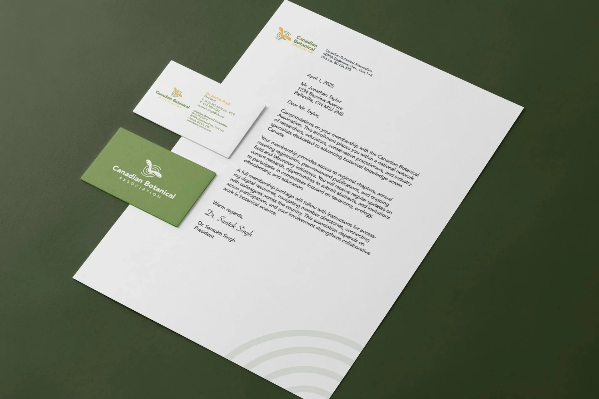
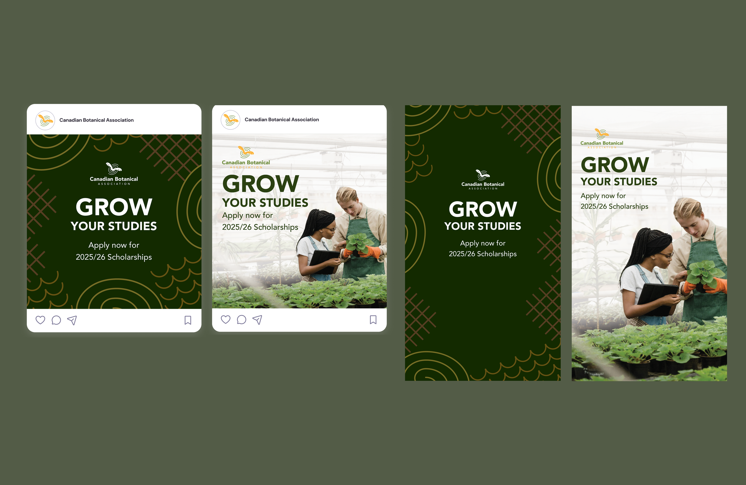
Visual identity including logo, brand colours, typographical system, and three types of brand applications.
Client
St. Lawrence College
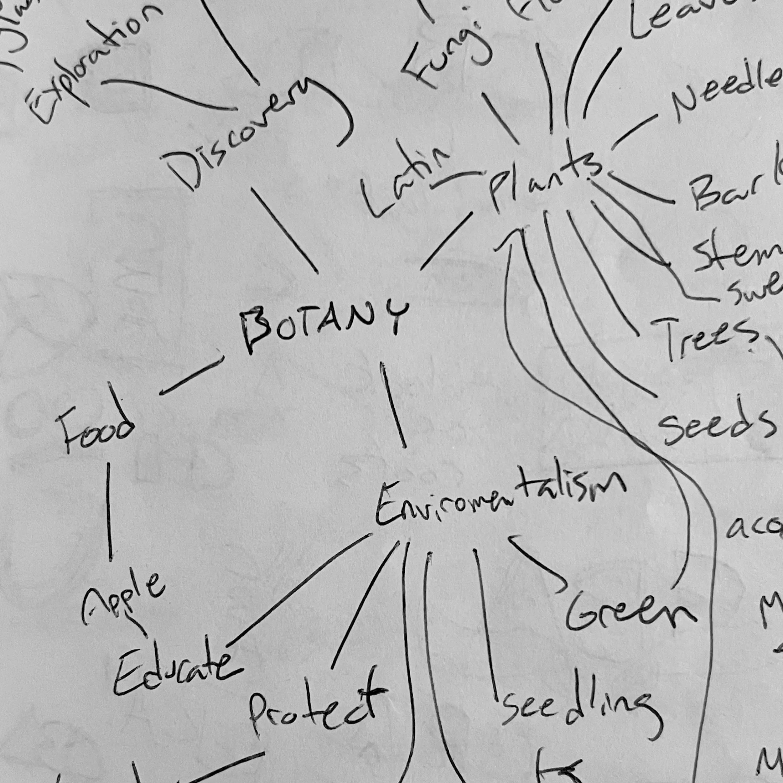
Research & Ideation
Research into other botanical associations showed frequent emblems and predictable motifs. To move away from that pattern, ideation focused on symbols and wordmarks that read as distinctly Canadian without blending into the broader association landscape. Two logo concepts were presented, and the second—the spinning maple seed—was selected to develop.

Concept
The logo uses spinning maple seeds to convey growth, movement, and the spread of knowledge while keeping a distinct Canadian reference without relying on a maple leaf.
Visuals
Gold and green in conjunction with the secondary brand colours helps distinguish the CBA from other botanical associations, along with plant-based patterns and motifs. Clean, professional photography of members on-site clarify the CBA’s missions and goals with the audience.
Strategy
The new identity positions the CBA as a national hub for botanists by emphasizing clarity, accessibility, and professional cohesion across print and digital materials, ensuring the association’s mission and activities are communicated consistently to members and the public, especially partners and donors.